Stroll Health: Redesigning the Patient-Facing Portal
2016 • USER RESEARCH • UX • UI • RESPONSIVE PRODUCT DESIGN

PROJECT OVERVIEW
About Stroll Health
Stroll Health, an early-stage health tech start-up, allows medical professionals and patients to make personalized, value-based referrals and informed decisions, respectively, regarding health imaging procedures and services of the sort.
The Challenge
To put it simply, people do not trust the internet when it comes to booking major medical procedures and imaging services. Stroll had an MVP patient-facing web portal which allowed consumers (or patients) to search for major medical imaging procedures and facilities. However, the product was incredibly difficult to navigate and had a dated user interface which required a complete redesign and rebranding for Stroll to secure proper funding.
Results & Solutions
A complete redesign of Stroll Health’s patient-facing portal, end-to-end, for desktop and responsive web
A rebranding of the product with an updated, redesigned modern user interface and fresh content in terms of copy
In 2016, Stroll Health won Traction’s Health 2.0 Startup Championship through our redesigns.
Role & Timeline
Worked on a team of 10 designers as a Product Designer with a UX-focus
The project was completed and delivered in 7 weeks.
THE DESIGN PROCESS

I. Discovery
Industry Trends
Provisional Personas
User Research + Synthesis
ANALYZING INDUSTRY TRENDS
We kicked off the Discovery phase by looking at the websites of other companies similar to Stroll — both those in the health-sphere and others such as Yelp, AirBnB and Kayak that also focused on price comparison and transparency. In doing so, we found that Stroll Health (at the time) was lacking a true UVP (“unique value proposition”) that really made it stand out in comparison to its competitors.

We also uncovered common patterns in the websites of these companies which helped to guide our design decisions along the way.
✔️PROS
• Clean User Interfaces
• A “Human” Feel
• Straightforward Value Propositions
• Simple Navigation Flows
• Clear and Simple Content Copy
❌CONS
• Information (Cognitive) Overload
• Content Copy Overload
• Lack of White Space
PROVISIONAL PERSONAS
Due to the specificity of Stroll Health's major value proposition, we really needed to understand the intended audience of the application. And, considering the fact that the founder of Stroll did so after realizing there was a huge problem with price transparency in the healthcare sector — he inspired one of the two personas we created. Ladies and gents, meet Georgia and Jay.


USER INTERVIEWS + SYNTHESIS
In total, we interviewed 16 people — 4 of which lacked health insurance. We were able to uncover the user behavior patterns of how people searched and booked medical appointments, as well as the major pain points they faced while doing so.

Direct Quotes from Interviewees
“I like to read patient reviews of doctors, especially if they’ve had a bad experience. ”
“Ideally, I’d just be able to go in and schedule through my calendar because I feel like phone conversations for calendar scheduling are way too complicated and unnecessary. Also, if there was a way to compare what the cost would be before going in because I feel like when you don’t have health insurance, it’s just scary in general because you have no idea how much it’s going to cost.”
Key Takeaways
✔️People tend to conduct research online and book by phone.
✔️People seek out and trust online reviews of doctors and facilities.
✔️Those who are insured care more about quality over price; whereas, those who are uninsured care more about the price.
✔️There is an overall lack of transparency in that most patients don’t understand the cost breakdown of their medical procedures and appointments.
II. Define
Design Principles
Necessary Features
Use Cases to Task Flows
Consolidated Task Flow
ESTABLISHING DESIGN PRINCIPLES
Knowing the founder's vision of Stroll Health, as well as our knowledge of the current health tech landscape, we established the following design principles prior to diving deep into the Ideation phase.

NECESSARY FEATURES
Through data modeling and an exploration of the previous patient portal, we mapped out six major features of the new patient portal. We chose to keep the key portions of the old, and incorporated some new one features to both address the uncovered pain points from our first set of user interviews and from our research on analyzing industry trends.
USER STORIES + USE CASES TO TASK FLOWS
Our small team of three, focused on UX, each created a task flow for one of the use cases. The three major use cases are as follows:

With much deliberation, flow critiques and brainstorming — we were able to create a consolidated task flow that solved for edge cases in Stroll’s new patient-facing portal experience.
CONSOLIDATED TASK FLOW
MVP
Thinking ahead for future post-procedure flows…
Given mainly the time constraints, we weren’t able to design the future and full interactions for the post-procedure experience. However, they were definitely taken into consideration, despite being out-of-scope.

III. Ideation
GVDS “Crazy 4s”
Wireframes
User Testing
Google Ventures Design Sprints' Crazy “4s”
To begin envisioning the mobile UI, we utilized the Google Ventures Design Sprints' "Crazy 8s" as a means of diverging and exploring as many UI options as possible (without groupthink). The GV Design Sprints were designed to allow for rapid prototyping in order to user test as soon as possible. Due to the scope of the project and the number of designers on the team, we decided to switch it up a bit and changed the exercise to the "Crazy 4s".


Note: Each dot or heart represents a "like" of a certain UI element
MOBILE WIREFRAMES
Feeling inspired after the GVDS's "Crazy 8s" (or "4s"), we went on to create the first set of mobile Lo-Fi's. Below are some of the original screens I created prior to conducting user testing.
USER TESTING (VALIDATION + SOLUTIONIZING)
We used Marvel to set up four prototypes with specific scenarios a user would encounter while navigating the Stroll mobile web app to conduct our second set of user testing. This helped us gain further insights, informed design decisions (such as adding a "Call" button) and validated why it was necessary for a user to be able to create an account.
Below are some of the changes we made, post-usability testing, from two of my Lo-Fi screens from the onboarding experience.

IV. Prototyping
Hi-Fidelity Mocks
Simplified Prototype
Hi-FIDELITY MOCKS
Below are some of the final hi-fidelity screens for mobile web and desktop, which encompass the primary “Start Search” and onboarding portion of the redesign.
.
Mobile Web
Desktop
SIMPLIFIED PROTOTYPE
Rather than displaying every screen of this massive redesign we took on, here is a simplified prototype of the Stroll patient-portal experience (through an iPad landscape view) for you to engage with. However, that’s not to say that this was all we designed and prototyped as the delivery consisted of well over 80 screens.
V. Validation
User Testing
Success Metrics
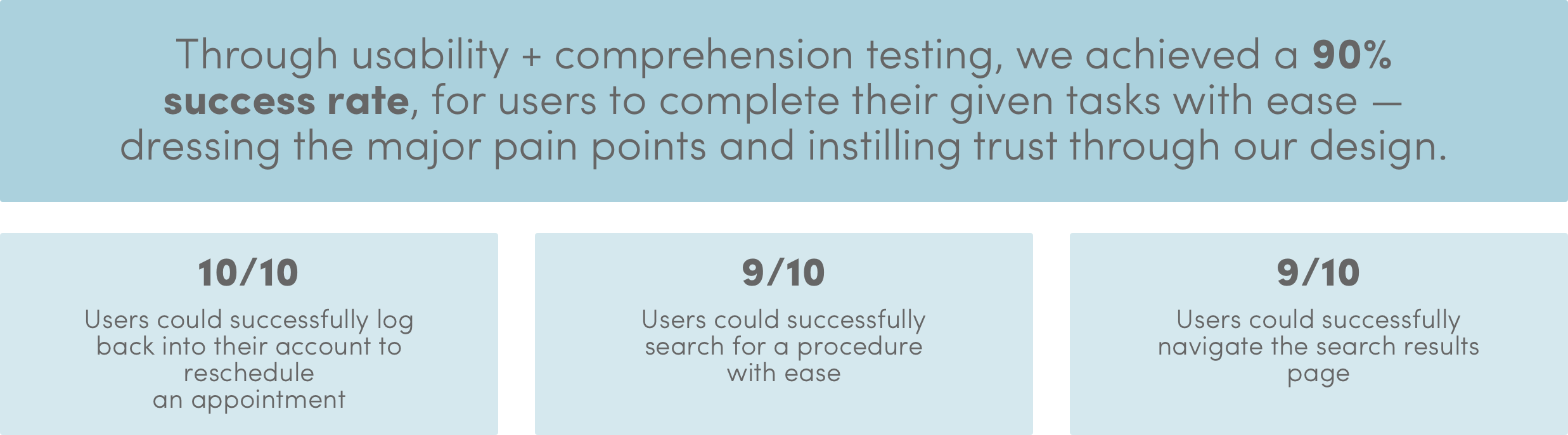
USABILITY + COMPREHENSION TESTING
For the final round of user testing — which included comprehension testing, usability testing and a final user interview with the completed desktop Hi-Fi's — we interviewed a total of 10 people which ranged from in-person user testing to remote testing via Skype through Marvel prototypes and screen-sharing.
As a huge advocate of Designing for Accessibility, it was my personal recommendation to the team to switch out our original background, as one of the older interviewees mentioned how much the bright background hurt her eyes. Based on our research, most seniors find the color yellow to be harsh on their eyes. In fact, the best hues for those that are older are the three primary colors — red, green and blue, as well as other muted tones.
SUCCESS METRICS
Given the context of the project, our primary success metrics were dependent on the usability and comprehension ability of the same set of users we interviewed from beginning to end of the design process.
VI. Delivery
Sketch + Zeplin
DELIVERY THROUGH SKETCH FILES + ZEPLIN
All in all, we delivered well over 80+ screens through Sketch, prototyped the interactions via Marvel, and integrated everything with Zeplin to make things simpler for the engineers to develop the entirety of the redesign.

LEARNINGS + REFLECTIONS
2016
This was the largest design team I'd ever worked with — which was an absolute struggle from time to time due to the wide range of bold and blunt personalities. This redesign taught me that large teams are often times not the most effective and can really slow a project down. It was also quite difficult at times because only the project leads were in contact with the main client. However, we were able to collaborate as designers throughout every step of the project as we held a common goal and vision. In the end, we were able to create a digital product that is not only user-friendly but also being fully implemented by Stroll Health.
•••
TODAY
Looking back on this project now, as a much more experience Product Designer, I understand the necessity of a large team to carry on such a hefty project with a short time limit. In any case, with a team of strong and experienced Product Designers, I truly believe all of the work could’ve been completed with 4 to 5 designers (tops). Accessibility should’ve been the focus from the start, and while I fully feel as though the underlying UX was executed extremely well, the UI design could’ve been designed with pixel-perfection in mind and far more delight and ingenuity.
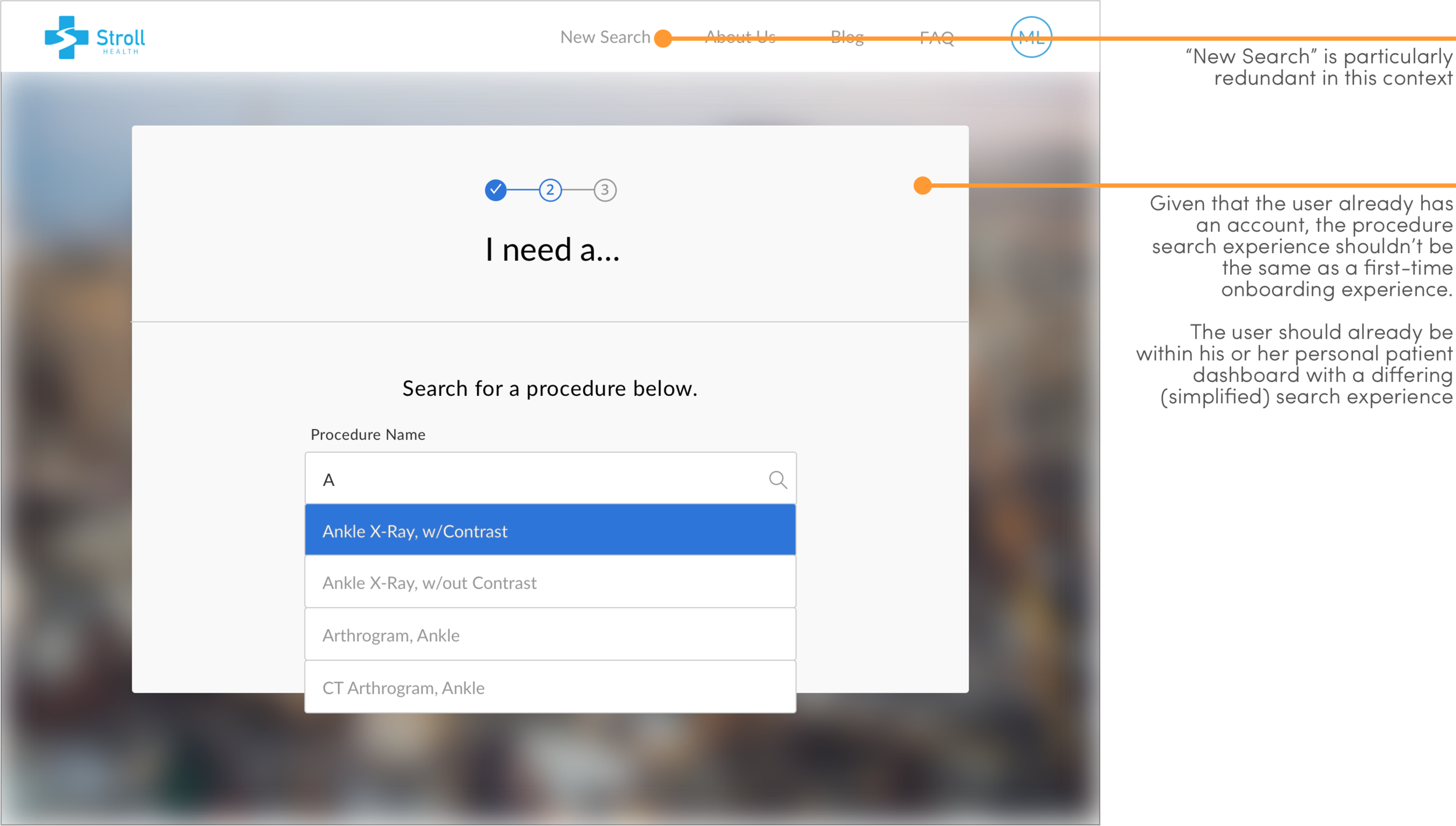
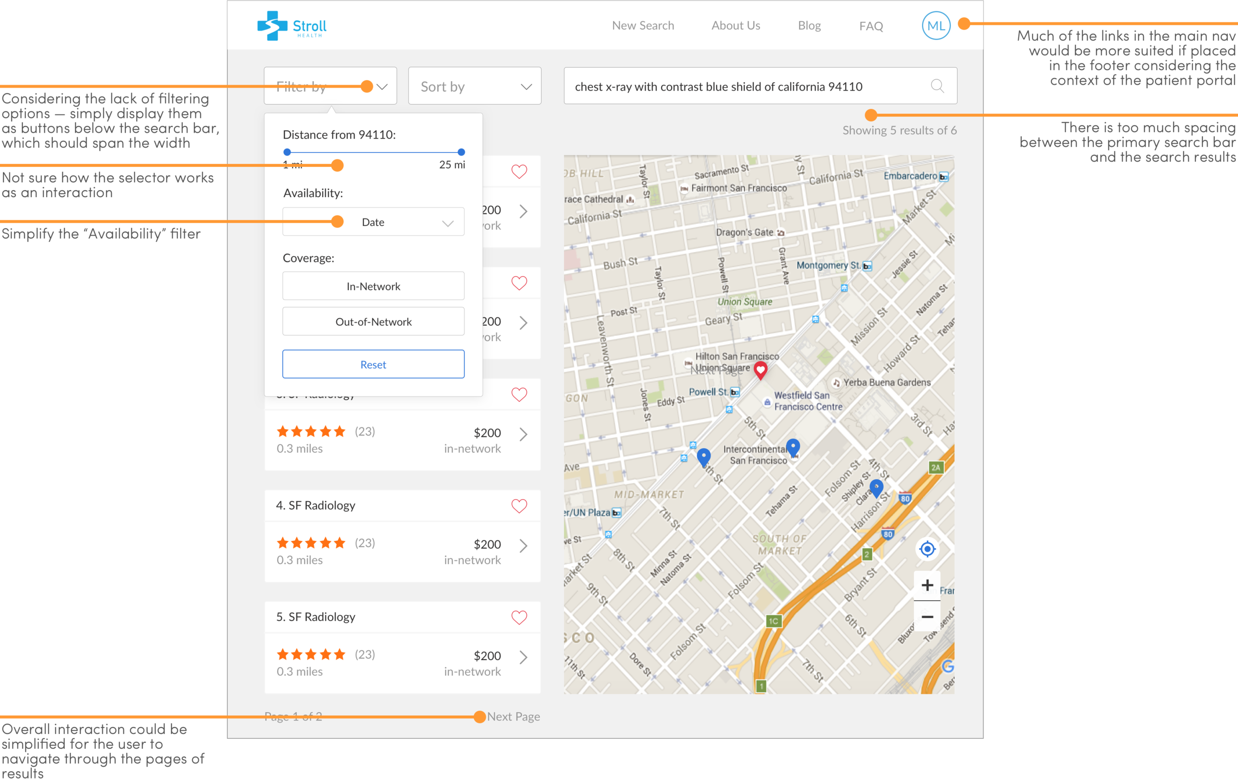
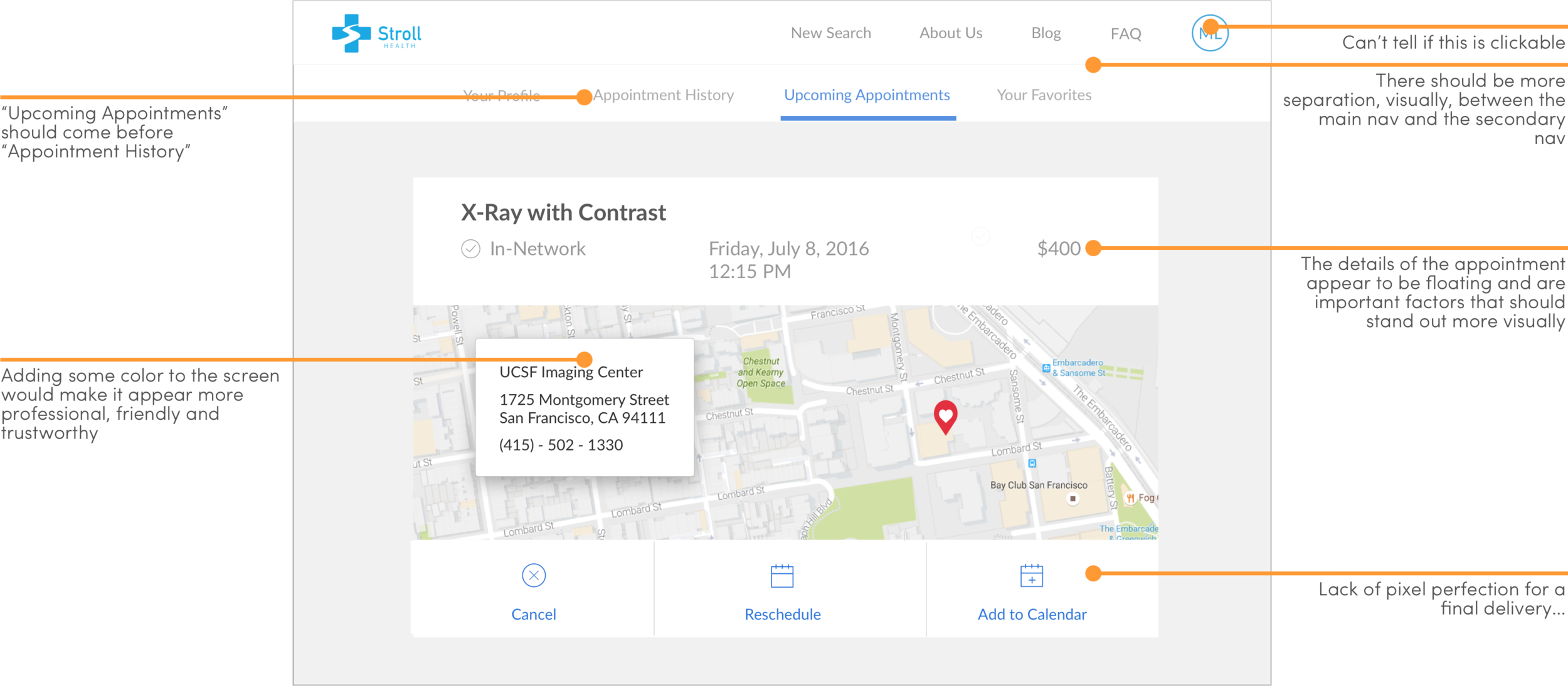
Here are some things I would do differently — annotations only, for now, but expect a redesign of certain screens soon.